Randy Richardson comments on the outcome in Iowa’s third Congressional district. -promoted by desmoinesdem
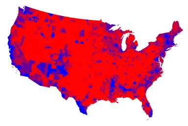
During the 2016 presidential election. I began to notice that several news channels made extensive use of county maps to explain election results. Following the 2018 midterm elections, several Iowa newspapers used similar maps to highlight the rural/urban split in election results.
However, those maps tend to give a skewed view of the election.
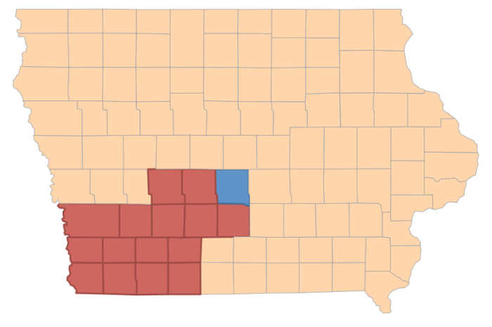
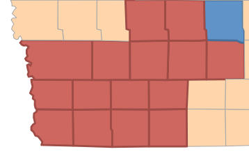
For example, if we look at a map of Iowa’s third Congressional District, we can see a huge swath of red, suggesting that David Young captured virtually all of that district.
Fortunately, we don’t base election results on the amount of geographic acreage that a candidate manages to win. In a representative democracy, winners are selected by a majority of the votes cast. Democrat Cindy Axne received 169,888 votes and Young 164,667 votes, according to unofficial results.
According to data from the Iowa Secretary of State, Polk County has 291,286 active voters. The fifteen counties that make up the remainder of the third Congressional district have a total of 229,280 active voters. While it is much more difficult to do, it is possible to use scaled maps that show the size of the county based upon its population and not on geographic area.
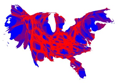
The Five Thirty Eight political website makes use of a computer program called Tableau to create election night maps called cartograms. These maps take into account population differences to more accurately reflect voter preference. While I don’t have access to the software, I borrowed two maps from the University of Michigan that show the 2016 election returns. The first map shows the traditional view of county by county results. The map just below is a cartogram that more accurately portrays the voting returns based on county population. As you can see, the red areas no longer dominate the map.
1 Comment
Fake news
BH readers probably don’t need to be told this but obviously some news outlets need to be told. Maps can confuse as much as they clarify when they are used badly as in the case you illustrate. News stories would be better if they just said only one county went for Cindy and skipped the map.
I don’t see why it is even relevant to break a district down into arbitrary pieces and then cast doubt on a victory by pointing out the victor did not carry enough of these arbitrary pieces of the district. She won the most votes. The rest is insider’s talk, not news.
iowavoter Mon 12 Nov 10:33 PM
Comments are closed.