DougJ, a data nerd who works with statistics and graphics all day long, offers a lesson in “Data Presentation 101.” -promoted by Laura Belin
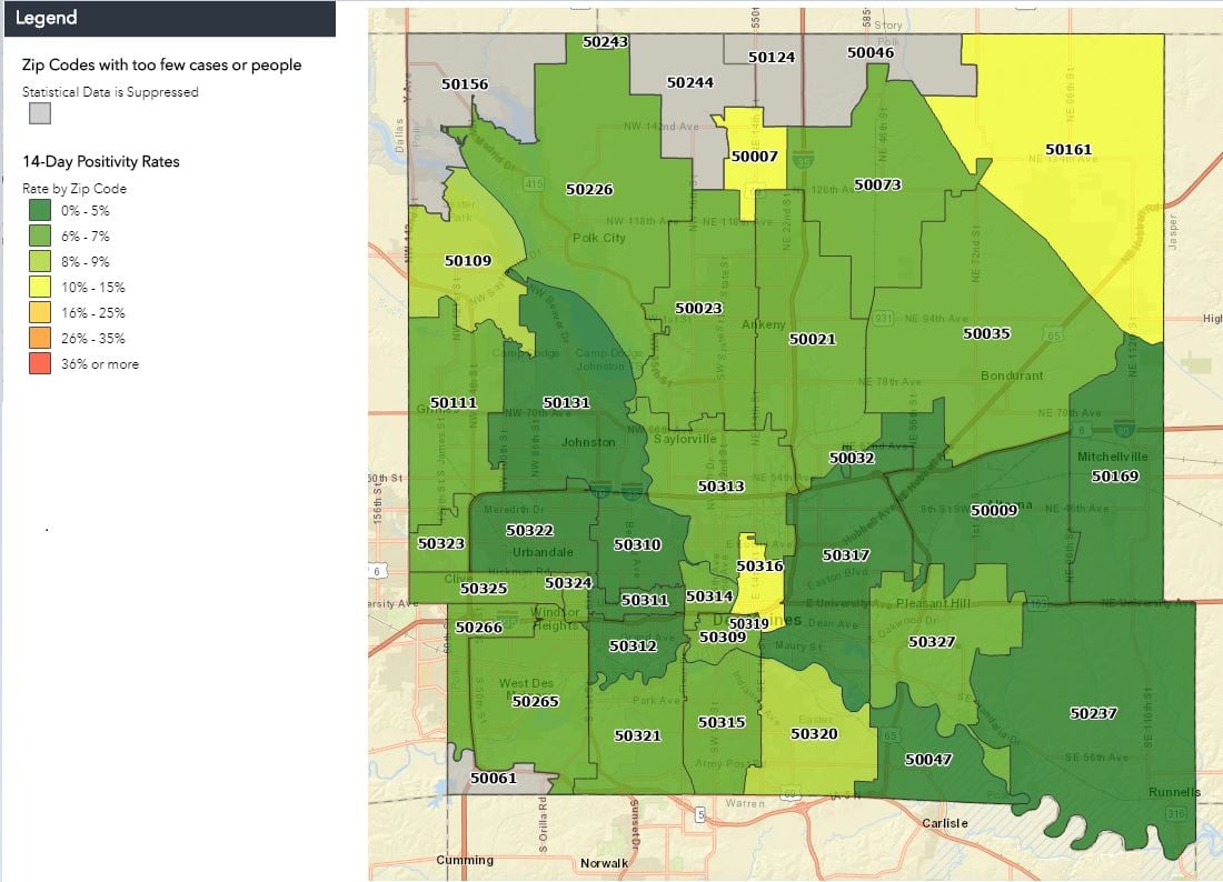
Let’s play “Fun with Gradient Scaling” on maps. I’m not a cartographer, but I do work with data and how it’s presented.
Here are three maps with different gradient levels. All of the graphs represent the same data, the 14-day average of positive COVID-19 tests in Polk County (containing most of the Des Moines metro area).
Many have questioned the accuracy of official positivity rates for Iowa counties, but I want to focus on how playing with the gradient can skew the perception of the data.