
DougJ, a data nerd who works with statistics and graphics all day long, offers a lesson in “Data Presentation 101.” -promoted by Laura Belin
Let’s play “Fun with Gradient Scaling” on maps. I’m not a cartographer, but I do work with data and how it’s presented.
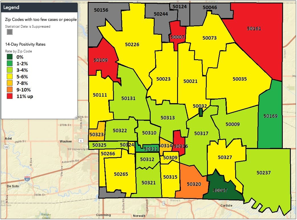
Here are three maps with different gradient levels. All of the graphs represent the same data, the 14-day average of positive COVID-19 tests in Polk County (containing most of the Des Moines metro area).
Many have questioned the accuracy of official positivity rates for Iowa counties, but I want to focus on how playing with the gradient can skew the perception of the data.
The main assumption for gradient scales is that green is good, yellow is a warning, and red is bad. It follows the stoplight format and is used in almost all industries, because it is easy to understand. That’s the real power of the gradient–and also how it can be manipulated to change the perception of the results.
The Polk County Public Health Department created the first map, which you can find here. (Editor’s note: Last month, the Iowa Department of Public Health began releasing COVID-19 data by zip code to county health departments.)
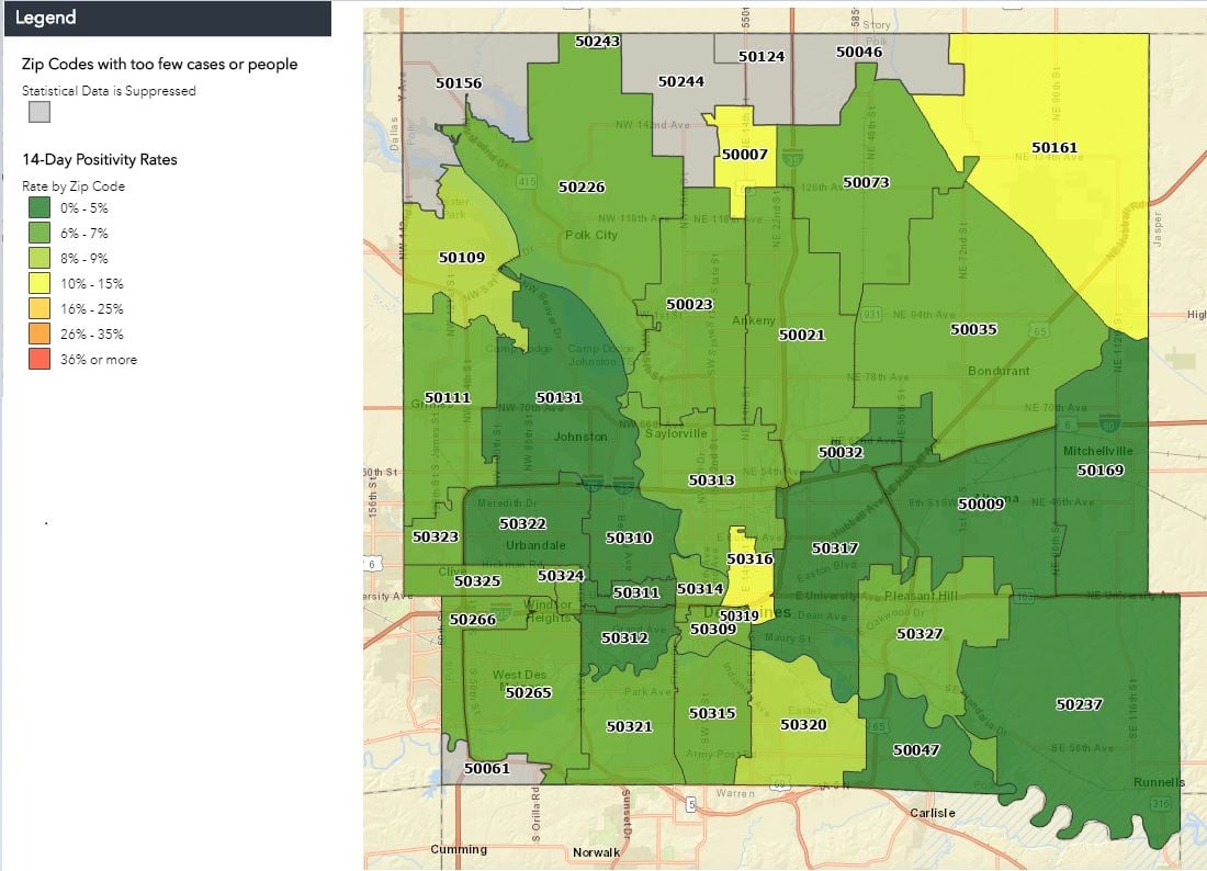
Even by the state of Iowa’s standards, the range is extremely wide (0 to 36 percent) relative to the expected results and what the data represents. The highest value on the map is less than 15 percent. The Iowa Department of Public Health and Iowa Department of Education have said a local positivity rate exceeding 15 percent could be a factor in shifting schools to online instruction.
So a 35 percent positivity rate is simply an outrageous and unexpected number. However, by making the range that big, the designer ensured that most of the map would be some shade of green. This makes it seem at first glance like everything is just fine, and there aren’t any issues with COVID-19 spread in Polk County. This fits the narrative state leaders want to convey.
I created this second graph, using a more realistic scale that matches the full range of the data (0 to 11 percent) and also aligns more closely with the U.S. Centers for Disease Control recommendations (10 percent is considered a significant outbreak, pointing to insufficient testing in the community). The coloration is drastically different on this map, which conveys a very different message. There are some red areas, many more yellow areas, and even the green areas are lightly colored, indicating a trend toward concerning positivity rates.
I created a third map aligned with the World Health Organization guidance: any positivity rate above 5 percent is considered significant community spread, pointing to a need for immediate action. On this map, Polk County zip code areas are mostly red and orange. There are some yellow areas and a couple of green ones. The map shows graphically that there is a significant COVID-19 problem in the county, relative to WHO guidelines.
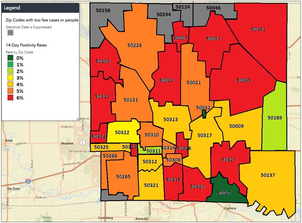
All of the data is the same. How you present it can significantly change how people perceive the results.
1 Comment
Excellent dissection
Garbage in and garbage out — your 3 maps and the explanations make it clear and the next Q is why did IDPH decide to handle the data the way it did?
VictoriaJZ Fri 9 Oct 5:14 PM