The Iowa Department of Public Health launched a new version of the state’s website for information and statistics on novel coronavirus on May 7.
The updated coronavirus.iowa.gov replaces a dashboard officials rolled out less than a month ago. That site debuted a demographic breakdown of COVID-19 cases and more details than had previously been available about hospital usage by region.
At her May 7 news conference, Governor Kim Reynolds said the latest changes were designed to make it easier for Iowans to access data about the virus.
After the jump I’ve reviewed what struck me as the most significant changes, for better or worse. My list isn’t exhaustive, so I encourage readers to spend some time exploring the website.
NEW: COUNTY CASE NUMBERS REAPPEAR ON THE MAP
On the “case counts” page of the new site, a map now shows confirmed COVID-19 cases for most counties.
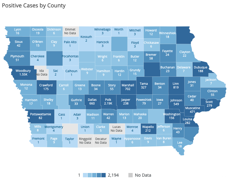
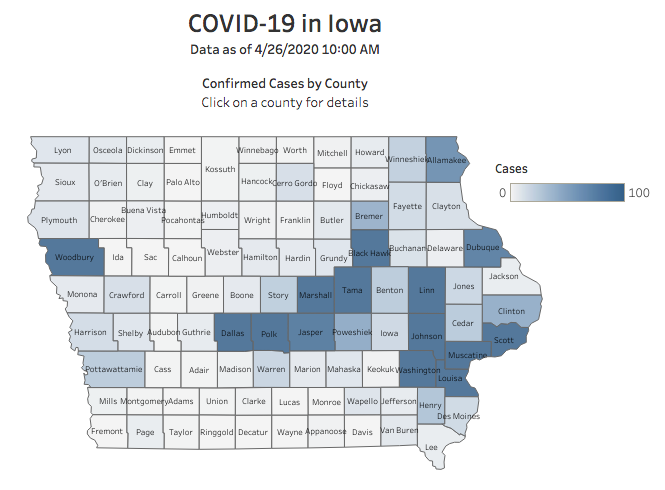
The first version of the state’s COVID-19 website had case counts on the map, but the dashboard created in April required users to click on individual counties to see case numbers. Here’s how it looked.
For some reason–maybe a glitch?–the new site doesn’t show case numbers for a few counties unless you click on them. Those counties include Black Hawk, a major hot spot not just in Iowa, but nationally. The IDPH should fix this problem.
NEW: SORTABLE TABLE SHOWING COUNTIES WITH MOST CASES
Just below the map on the “case counts” page, a table makes it easy to find current COVID-19 case numbers for each county.
Here’s how the top of that table appeared on May 9, when sorted by counties with the most confirmed infections.
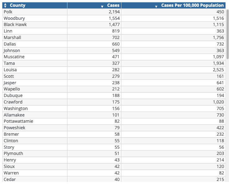
One click sorts the table by how prevalent the virus is in each county, which can be more revealing than raw case numbers. Now it’s easy to see that Louisa, Tama, and Marshall counties (where the first outbreaks happened in Iowa meatpacking facilities) have more COVID-19 cases per capita than more populous counties.
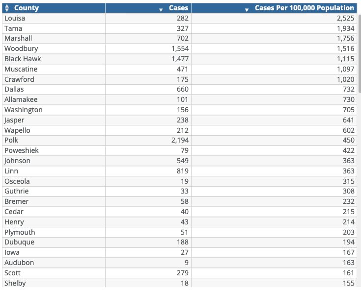
By the same token, the per capita infection rate is much higher in Woodbury and Black Hawk counties (where many residents work in nearby beef or pork processing plants) than in Polk, Linn, or Johnson counties.
Speaking of pork processing plants, note that Crawford County (Denison) is now in the top ten for COVID-19 cases per capita, and Wapello County (Ottumwa) ranks twelfth. Governor Reynolds unwisely included those counties among the 77 where she lifted restrictions on some business activity, effective May 1.
Case counts will likely rise substantially in Crawford in the coming days, as the IDPH scheduled drive-through testing in Denison for May 9. (The mayor had initially been turned down for expanded testing.)
NEW: GRAPHS SHOWING CASES OVER TIME, STATEWIDE AND BY COUNTY
At her latest press conference, Reynolds highlighted one of the best features of the new site: “We’ve created a more visual dashboard that allows you to follow trends on a daily basis and filter data down to a specific day or county so Iowans can access the information that’s most relevant to them.”
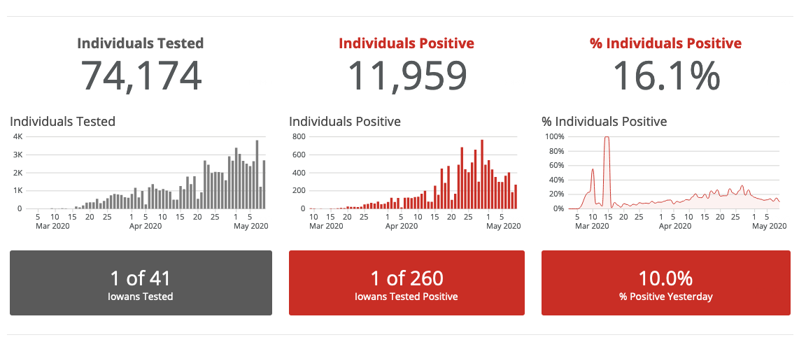
Just above the map on the “case counts” page, interactive graphs show how many Iowans were tested on each day, how many tested positive, and the percent of tests that came back positive for each day. Hovering the cursor over any bar brings up the number for that day. Here’s how that part of the site looked on May 9.
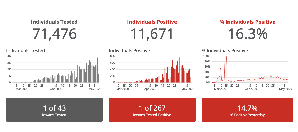
Important caveat: many patients have been tested two or three times. IDPH should release the number of unique individuals who have been tested for COVID-19. Saying “1 of 43 Iowans Tested” is misleading. UPDATE: A reader noted that the number of negative tests for each day is no longer displayed. Those figures used to be easy to find.
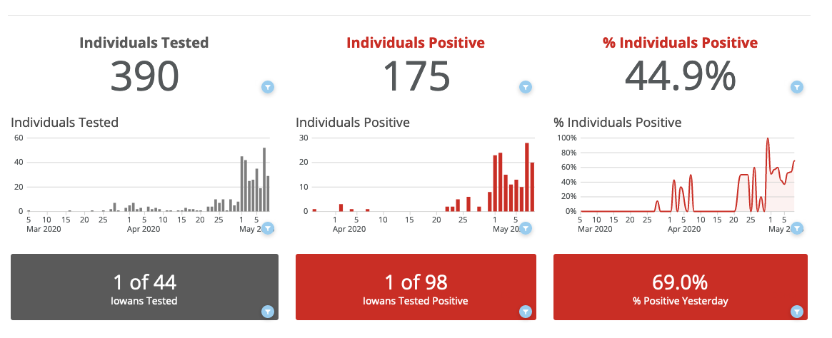
Scrolling down to the map, you can click on any county or group of counties to filter the graphs for that county. Here are the numbers for Crawford County, where cases sharply rose just as Reynolds started opening things up.
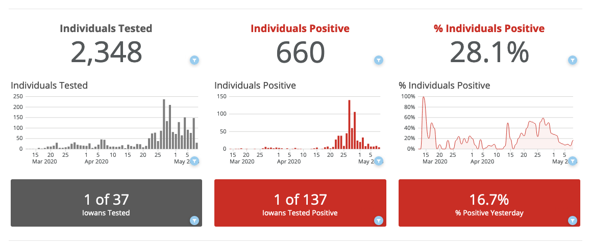
Here’s how it looks for Dallas County. A few COVID-19 cases were identified early in the pandemic, but numbers in the area were stable until an outbreak led to mass testing of workers at Tyson’s pork processing plant in Perry.
Again, hovering over any bar on those graphs will bring up the number of tests performed (not unique individuals tested) or the number of cases reported, for that county (or group of counties) on any day. The old website didn’t provide that function, so if you weren’t keeping screen shots or spreadsheets with daily numbers, it was hard to look back in time.
Incidentally, the Des Moines Register’s data visualization specialist Tim Webber has created a good tool allowing users to enter up to five counties and see the curve of reported cases over time for each.
NEW: MORE TIMELY DATA
Reynolds explained on May 7 that “information will now be timelier” on the new site. Previously, numbers posted each day reflected data the IDPH had received as of 10:00 am the day before. Often there was a lag between what county health departments were reporting and the case numbers for that county on the state’s website. Now the daily numbers will reflect information reported from 12:00 am to 11:59 pm the previous day.
For that reason, daily numbers “will not match up with what we previously reported” on news releases and at press conferences, Reynolds noted. “I can assure you that the numbers are accurate. They just reflect a different period of time.”
It’s useful to have more up to date figures each day, but the discrepancy will be inconvenient for people who have been maintaining their own spreadsheets or graphs (like me or Scott Foens). The numbers we have entered every day won’t reconcile with the numbers on the state’s official site.
Reynolds said a new feature allows users to export data from the website to a spreadsheet or other kind of file, which “should make the data more functional for you.”
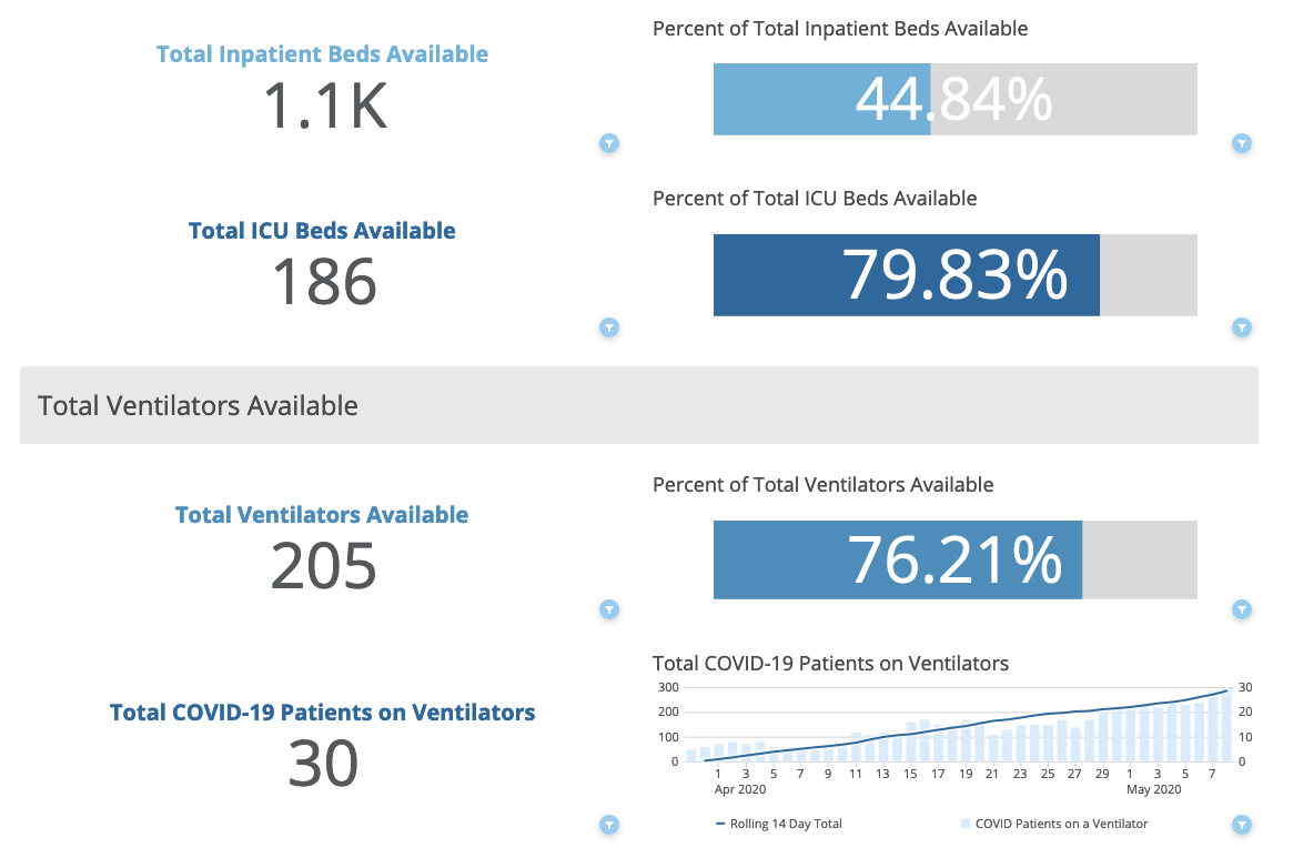
NEW: GRAPHS SHOWING HOSPITALIZATION NUMBERS OVER TIME
The “RMCC Dashboard” brings up hospitalization information statewide and in the six regions that roughly correspond to where severely ill patients are transferred. (RMCC stands for Regional Medical Coordination Centers.) Most Iowa hospitals don’t have intensive care units and send their critical cases to larger facilities.
Here’s the statewide information that appeared on May 9.
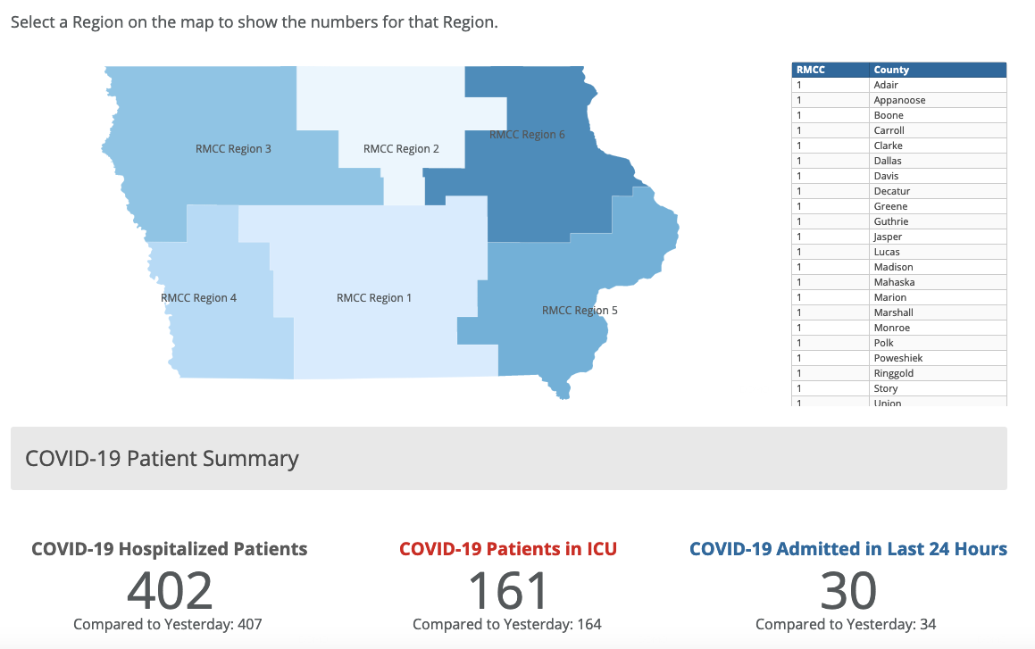
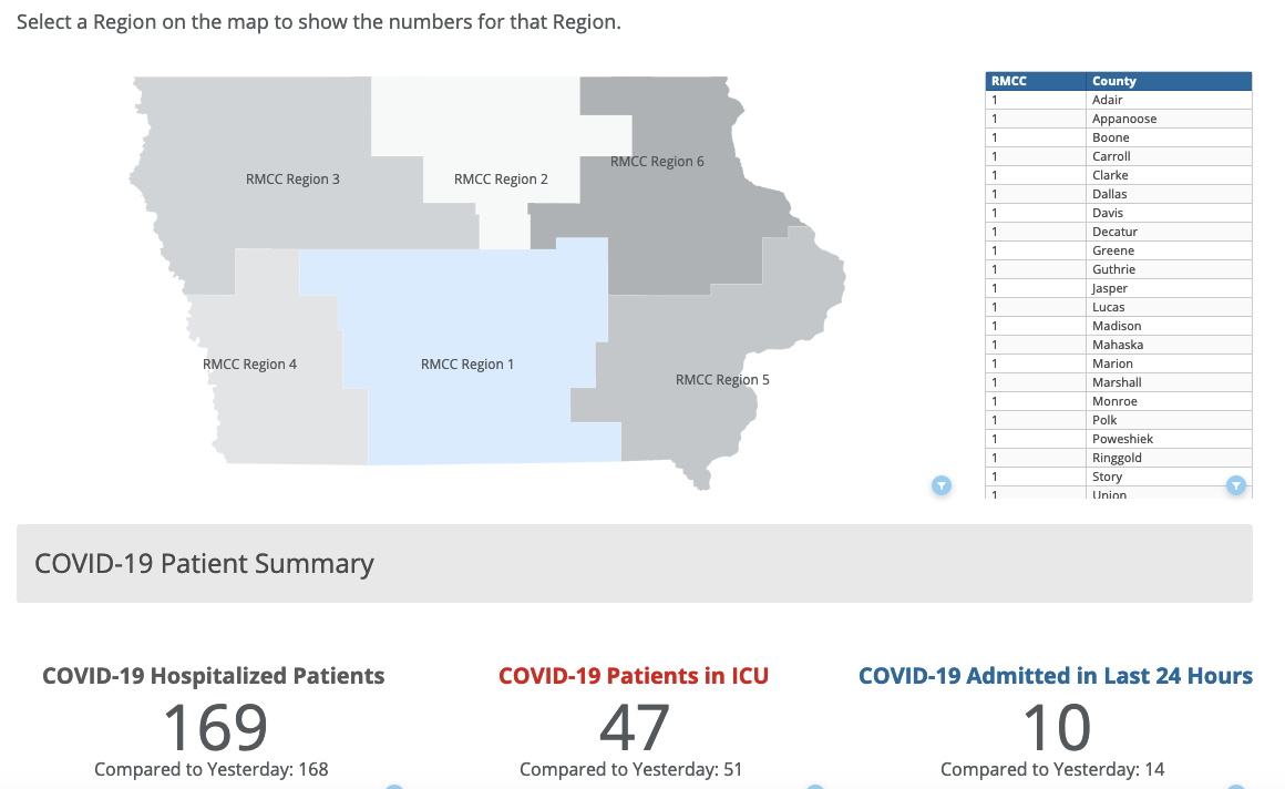
Here’s the data for Region 1 (including the Des Moines metro and a large area in central and southern Iowa).
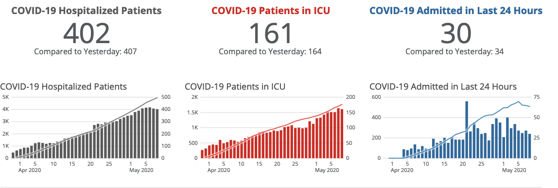
Scrolling down, you can find interactive graphs showing how these numbers have changed over time. Here’s hoping the slight tick downward in hospitalizations over the last couple of days is the beginning of a trend and not a blip.
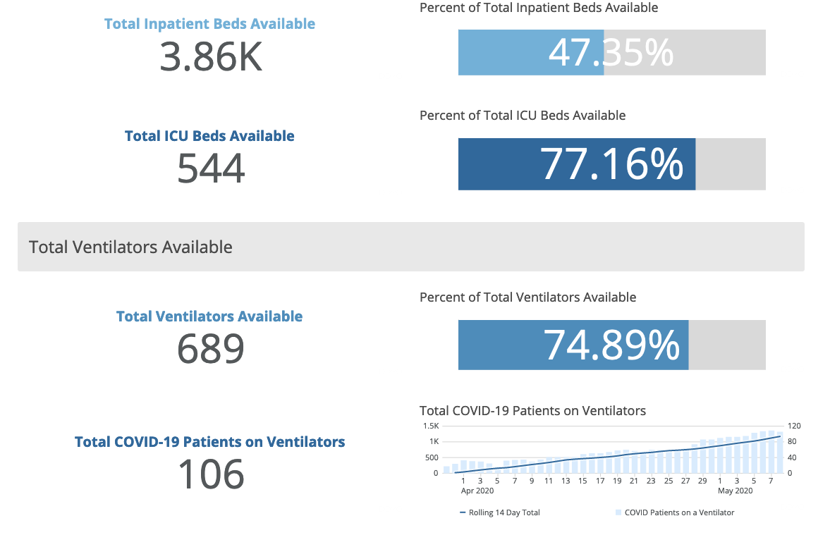
Moving further down the page, you can find data on ventilator usage for the most severely ill COVID-19 patients. These are statewide figures.
A click will bring up the totals for a specific region. Here’s the data for region 1 on May 9.
NEW: DETAILS ON IOWANS WHO HAVE TAKEN THE “TEST IOWA” ASSESSMENT
The “Test Iowa Assessments Dashboard” shows statewide and county-level figures for Iowans who have completed the online assessment that’s part of the Test Iowa program.
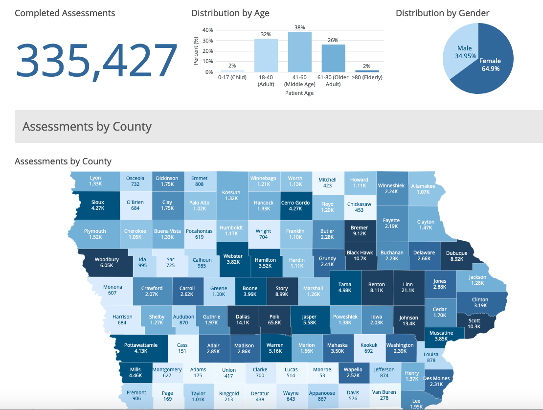
Many people have filled out the assessment multiple times, so it’s not clear from these figures how many unique individuals have filled out the online form.
Also worth noting: only 2 percent of assessments have come from Iowans over age 80, a group that accounts for about 5 percent of coronavirus cases and 46 percent of our state’s fatalities to date.
When I speculated that Test Iowa could miss a lot of Iowans in high-risk groups, such as seniors who don’t own a computer or cell phone, some readers thought I was being too negative about a great program. But the Des Moines Register’s Barbara Rodriguez interviewed Iowans in that very situation. “They just assume everyone has a computer,” one told her. “Getting medical care should not be based on whether you have a computer,” said another.
Now, let’s turn to some data I haven’t been able to find on the new website.
GONE: FIGURES ON COVID-19 DEATHS BY COUNTY
The previous state website displayed COVID-19 cases and deaths by age group for each county, and those tables were easy to download. Here’s the pdf version of the last one I saved, for May 5. The page showing fatalities looked like this:
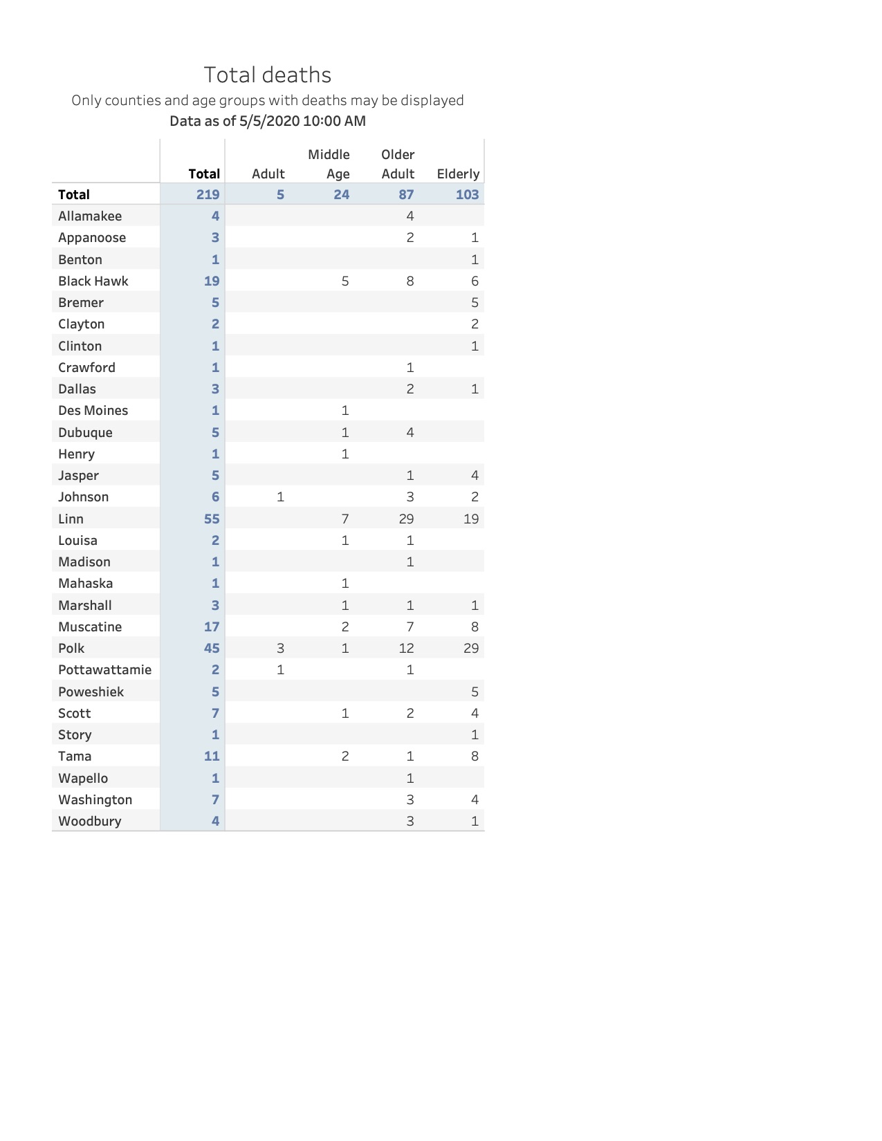
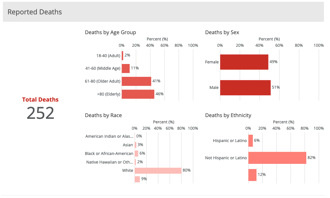
The new site shows deaths broken down by age group, sex, race, and ethnicity, but I haven’t been able to find fatality numbers for each county.
IDPH spokesperson Amy McCoy hasn’t responded to Bleeding Heartland’s inquiry about why this information no longer appears on the website. If those figures are lurking somewhere, I’d be grateful for someone to point me in the right direction.
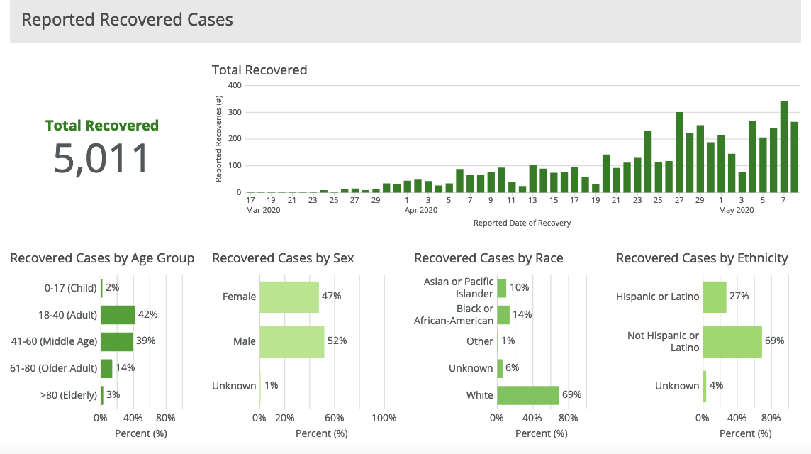
UPDATE: A reader mentioned that the old website also displayed recovered cases by county, which don’t seem to be available anymore. As with deaths, recovered cases are shown by age group, sex, race, and ethnicity.
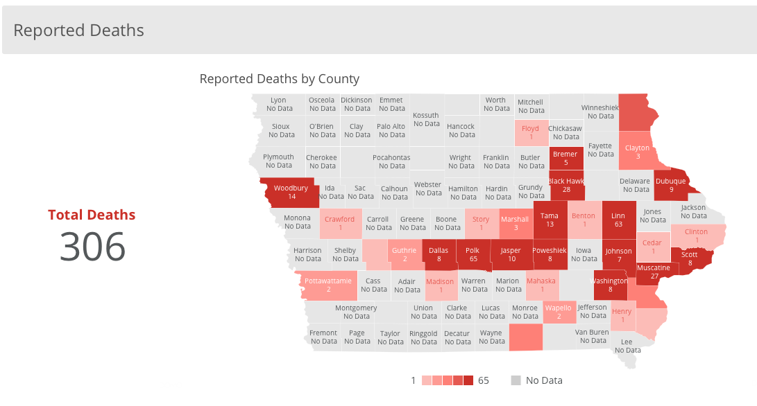
SECOND UPDATE: Ditchwalk found a page that lists deaths by county (though not broken down into age groups for each county). To get to it, you have to start from the main page and click the blue link that says “Accessibility Status Page.” It’s near the lower left corner in this screen shot.
THIRD UPDATE: On May 13 a map showing COVID-19 deaths by county appeared on the website. You still can’t find the age breakdown of deaths for each county. At this writing, 33 counties have recorded at least one coronavirus death.
GONE: A DEDICATED PAGE FOR NEWLY-REPORTED CASES AND DEATHS
The previous website had a tab for “24-hour cases and deaths.” Clicking on it would bring up the number of newly confirmed COVID-19 infections for the whole state and a table showing the ages and county of residence of all Iowans who had died during the last reporting period.
On the new website, you have to calculate statewide numbers by subtracting yesterday’s total cases and deaths from the latest posted figures. You can’t easily determine which counties accounted for the newly reported fatalities.
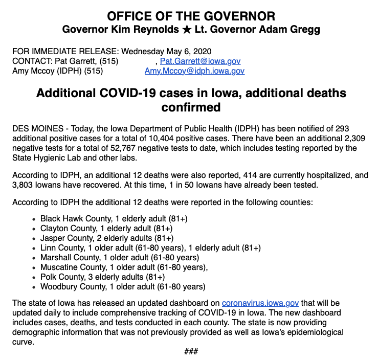
Compounding the problem, the governor’s office and IDPH seem to have stopped issuing daily news releases with the case and death numbers from the previous day. These had been coming out every day since mid-March, but I haven’t received one since May 6. They looked like this:
It should be easy to find how many Iowans tested positive or died from coronavirus during the last 24 hours.
Not everything removed from the website will be missed, though.
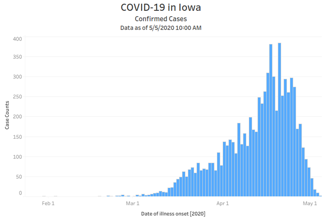
GONE: THE MISLEADING “ONSET OF SYMPTOMS” EPI CURVE
The second version of the state’s website introduced an “epi curve.” As Bleeding Heartland discussed here and here, the curve created the impression that coronavirus infections had peaked and were on a downward trend in Iowa. But the graphs were misleading, because they displayed onset of symptoms data rather than confirmed COVID-19 cases.
Dr. Eli Perencevich, an infectious disease specialist and epidemiologist at the University of Iowa, had questioned the state’s presentation of the data as recently as May 6.
Why does Iowa’s #COVID19 “date of illness onset” epidemic curve still not include the warning: “illnesses that began during this time may not yet be reported” that CDC includes?
CDC: https://t.co/5SYzFLwFZN
Iowa: https://t.co/mB2aee9C35 (epi curve tab) pic.twitter.com/Wb5KzkEtC9— ??? ??????????? ? ? (@eliowa) May 6, 2020
As of May 7, the state is no longer presenting daily figures for onset of symptoms.
UPDATE: Ditchwalk got a screen shot of the epi curve on the last day it was posted.
GONE: REGIONAL SCORES ON THE DEPARTMENT’S 12-POINT MATRIX
On the previous website, the RMCC page showed each region’s score on a twelve-point matrix that was a misguided way to evaluate the pandemic’s spread in Iowa. Here’s how the map looked in mid-April, shortly after the northeast region hit a “10” and Reynolds imposed stricter limits on social gatherings in fourteen counties.
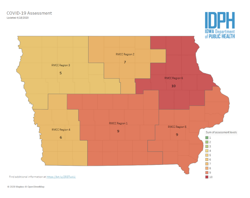
Reynolds and her advisers subsequently abandoned that regional approach mitigation policies for one that looked at COVID-19 case numbers in counties. (Her April 27 proclamation loosened restrictions in 77 counties where, she alleged, virus activity was low or on a “downward trend.”)
Unfortunately, that’s still a poor substitute for modeling the spread under various scenarios. Nevertheless, I speak for many in saying good riddance to the matrix, an “arbitrary” and “backward looking” scoring system that used older Iowans “like a canary in the coal mine to determine how bad things are,” in Dr. Perencevich’s words.
If you’ve delved into the the state’s revamped website, please share your impressions in this thread or by contacting me directly. Private messages will be kept confidential.
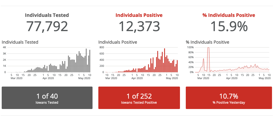
UPDATE: There are some discrepancies in the data. On May 10, the site was updated to show 11,959 individuals positive, which was 288 more than the number shown the previous day. But the “individuals positive” bar graph showed 269 individuals tested positive on May 9. I’m seeking comment from the IDPH.
MAY 11 UPDATE: More discrepancies, as the latest summary statistics show 12,373 individuals tested positive. That’s 414 more than yesterday’s total. But the bar graph indicates 389 Iowans tested positive on May 10.
3 Comments
Investigate counting of deaths
Thank you for the in-depth analysis of the new website. I share you concern about eliminating the number of new cases each day. That’s the most obvious measurement and its now buried. Another question to investigate is the number of Iowans who have died. It seems suspiciously low compared to number of cases and hospitalized. I read somewhere that NY State counts only deaths that occur in a hospital which also means the person was tested. If a person dies while still in a nursing home or at home they are not counted in the daily reports. How are these victims counted in Iowa? Do you agree the number of deaths is surprisingly low and do you have a theory why? Thanks again. Governor Cuomo’s daily analysis has nothing on Bleeding Heartland’s analyses.
miketram01 Sun 10 May 2:30 PM
Doubling time
Back on April 19 I pointed to Iowa’s slow doubling time. It was 8 days. Now our doubling time for both total cases and deaths is 13 days. Spread is slowing.
iowavoter Mon 11 May 5:43 PM
doubling time is increasing
We’ll see if that trend continues as the governor allows more businesses to reopen.
Assuming the doubling time extends to 25 days, we would still have more than 1,000 dead by the end of June and more than 2,000 dead by the end of July.
Laura Belin Tue 12 May 2:58 PM